How to Configure Theming or Theme Switching with React and TypeScript
I had a project requirement to support theming in react-based applications. So there I have come up with a simple and quick solution to build an application with a pre-defined theme (mainly background color, text color, fonts, etc). Let's check how I have approached solving the problem.
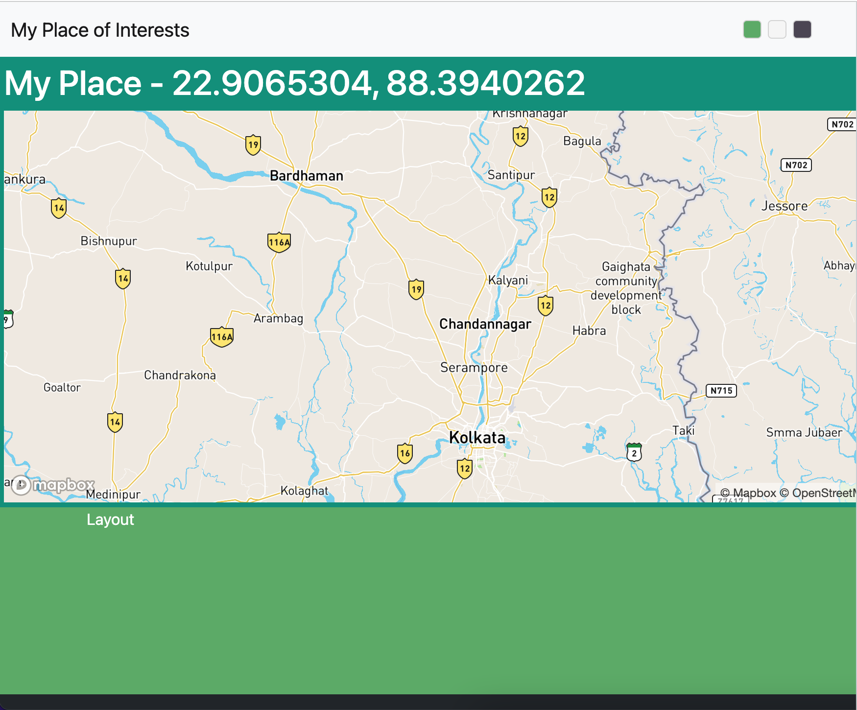
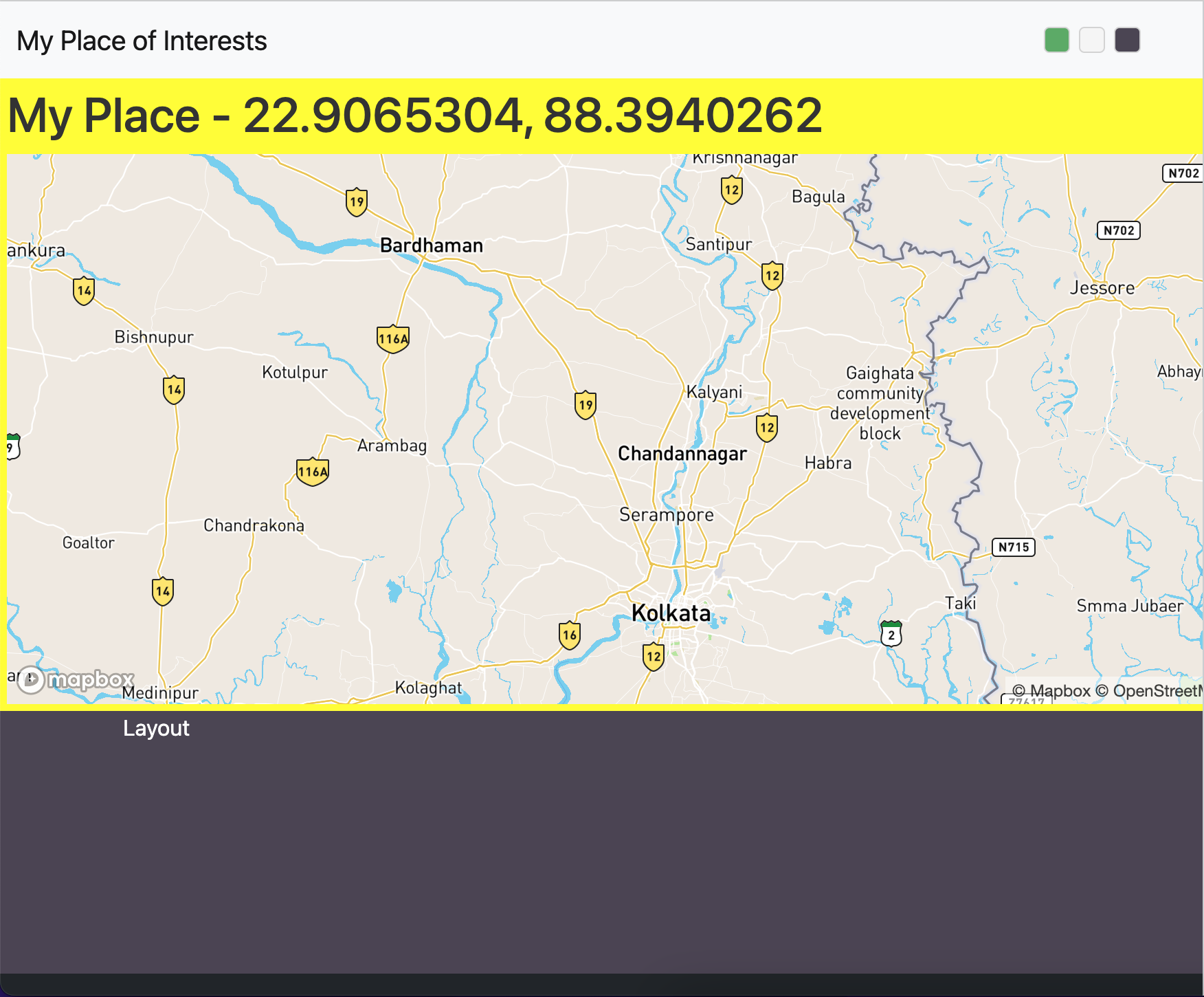
Themeing & Theme Swtiching
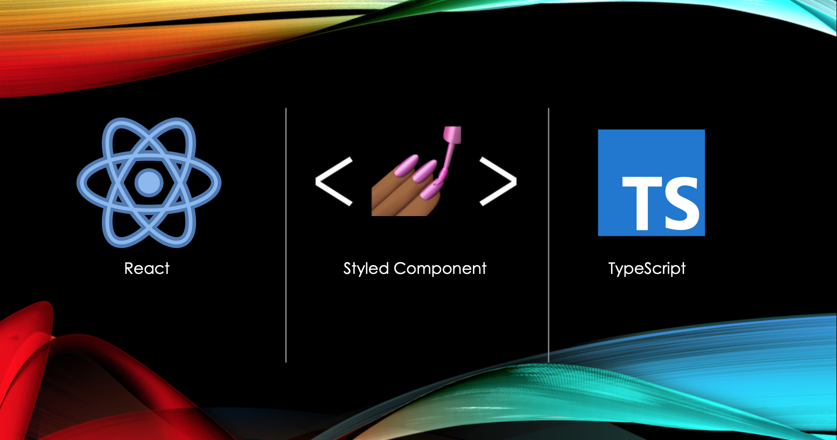
* leverage styled-componet (npm library)
* define a theme model (holds the property I want to change - such as background color, text color)
* create multiple theme & apply switch function
* leveraged React Context API to store theme value
What would it look like?
Above I have three different colors and based on theme value, I can change the background color and text color.
Setup React with TypeScript
Let's set up an application with React, TypeScript and styled-component. I will be using create-react-app command to build the application.
// setup
npx create-react-app redux-demo-app --template typescript
npm install --save @types/react-router-dom
// add botstrap
npm install --save bootstrap react-bootstrap
npm install --save node-sass
// add styled-components
npm install --save styled-components @types/styled-components
Also, import @import "~bootstrap/scss/bootstrap"; as well as your scss file. All project is now setup and it will run the application on your web browser.
What is styled-component & what it is being used?
styled-components: A flexible way to style React components with CSS. It provides out-of-the-box theming support using a wrapper component called, <ThemeProvider>. This component is responsible for providing the theme to all other React components that are wrapped within it.
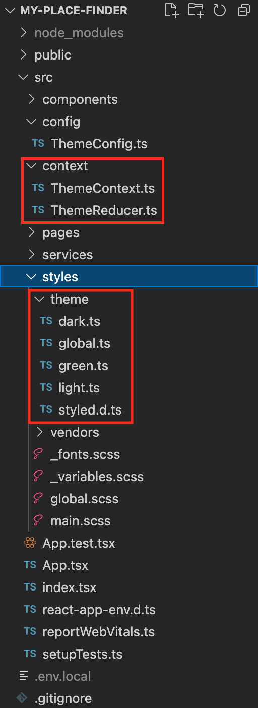
Folder structure and multiple theme file creations
Before implementing a theme file, let's create some folder structure for which I can keep respective files (.tsx, .ts, and .scss) files to configure my codebase.
Create styled.d.ts file for TypeScript and here we will be defining our theming properties.
styled.d.ts
import 'styled-components';
declare module 'styled-components' {
export interface DefaultTheme {
themeType: string;
colors: {
background: string,
text: string
};
section: {
background: string;
text: string;
}
}
}
Now, based on the above model, let's create 3 files - green.ts, light.ts and dark.ts.
green.ts
export default {
themeType: 'green',
colors: {
background: '#59ab64',
text: '#fff'
},
section: {
background: '#008F7A',
text: "#fff"
}
};
light.ts
export default {
themeType: 'light',
colors: {
background: '#f5f5f5',
text: '#333'
},
section: {
background: '#D9F7E7',
text: "#B0A8B9"
}
};
dark.ts
export default {
themeType: 'dark',
colors: {
background: '#4B4453',
text: '#fff'
},
section: {
background: 'yellow',
text: "#333"
}
};
So, I have 3 different theme models, and based on user choice I will load the theme file accordingly. Also, I have one global style to update the theme value based on the user's choice.
You are all set with theming files, let's implement Context API as well to keep user choice and pass the value where ever is required.
Create a Context store to hold user choice
I am going to create a context store and reducer for storing and updating the context value accordingly.
ThemeContext.ts
import { createContext } from 'react';
import { DefaultTheme } from 'styled-components';
export interface IPlaceThemeProvider {
currentTheme: DefaultTheme;
setNewTheme: (args: DefaultTheme) => void
}
export const PlaceThemeContext = createContext<IPlaceThemeProvider>({} as IPlaceThemeProvider);
ThemeReducer.ts
import { DefaultTheme } from "styled-components";
const ThemeReducer = (state: any, updatedTheme: DefaultTheme) => {
return {...state, updatedTheme};
}
export default ThemeReducer;
So far, I have the following granular stuff, and the only thing remaining is to call some methods accordingly. Let's see what I have so far and what is remain to build -
What I have so far -
- React with TypeScript code has been configured
- The theme has been configured
- Context store has been setup
- imported bootstrap CSS
What is remain?
- Need to encapsulate the whole app by context provider and set the default theme to load
- Update context store, if the user make some different choice
- Optimize code re-rendering method by using memo & useCallback
- Demo
Integrate context provider & load app with default theme
In App.tsx file, I am going to declaire theme context and initialize with default theme value.
In header.tsx file, I have an option to chnage the theme, and for that I need to load all three options (green, light & dark) and using useContext hook I can get the current context store value and update accordingly by calling reducer method.
Header.tsx
const themeContext = useContext(PlaceThemeContext);
const themeSlection = useCallback((type: string) => {
const selectedTheme: IThemeConfig = themeArray.filter(theme => theme.themeName === type)[0];
themeContext.setNewTheme(selectedTheme.themeValue);
}, []);
Render method
<ThemeContainer>
{themeArray.map((theme: IThemeConfig, index: number) => (
<Box type={theme.themeName}
boxColor={theme.themeColor}
onBoxClick={themeSlection}
key={index}></Box>
))}
</ThemeContainer>
//Box component
type Props = {
type: string,
boxColor: string,
onBoxClick: (type: string) => void
}
const Box = (props: Props) => {
return (
<>
<CustomContainer className={`${styles["box"]}`}
style={{ backgroundColor: `${props.boxColor}` }}
onClick={() => props.onBoxClick(props.type)}
></CustomContainer>
</>
);
}
export default memo(Box);
Here, in above using memo and useCallback hooks will restrict to reload child component, in case of changing differnet theme.
Demo:
Please share your comments and happy Coding!
- LP

Loading comments...