Best way to handle Tailwind CSS preset configuration for responsive UI
Tailwind CSS is very popular nowadays, and it is a utility-first CSS framework. It is already giving many in-build CSS classes to use your application, which sometimes makes a very clumsy HTML CSS class list, and makes it very difficult to manage all your CSS classes in a production environment. In this blog, I am going to use the Tailwind CSS with React application and make a production-ready responsive UI with proper configuration.
Why do I choose the Tailwind CSS framework to build my application?
- Highly Customizable - It has tailwind.config.js and tailwind.preset.js files, using that we can make easy customization of color palettes, styling, spacing, themes, etc.
- Common Utility Pattern - The naming convention is easy to understand and can be created custom utility pattern.
- Building Complex Responsive Layouts - It uses a default mobile-first approach. The availability of utility classes makes it easier to build complex responsive layouts freely. Utility classes can be used across a variety of breakpoints conditionally.
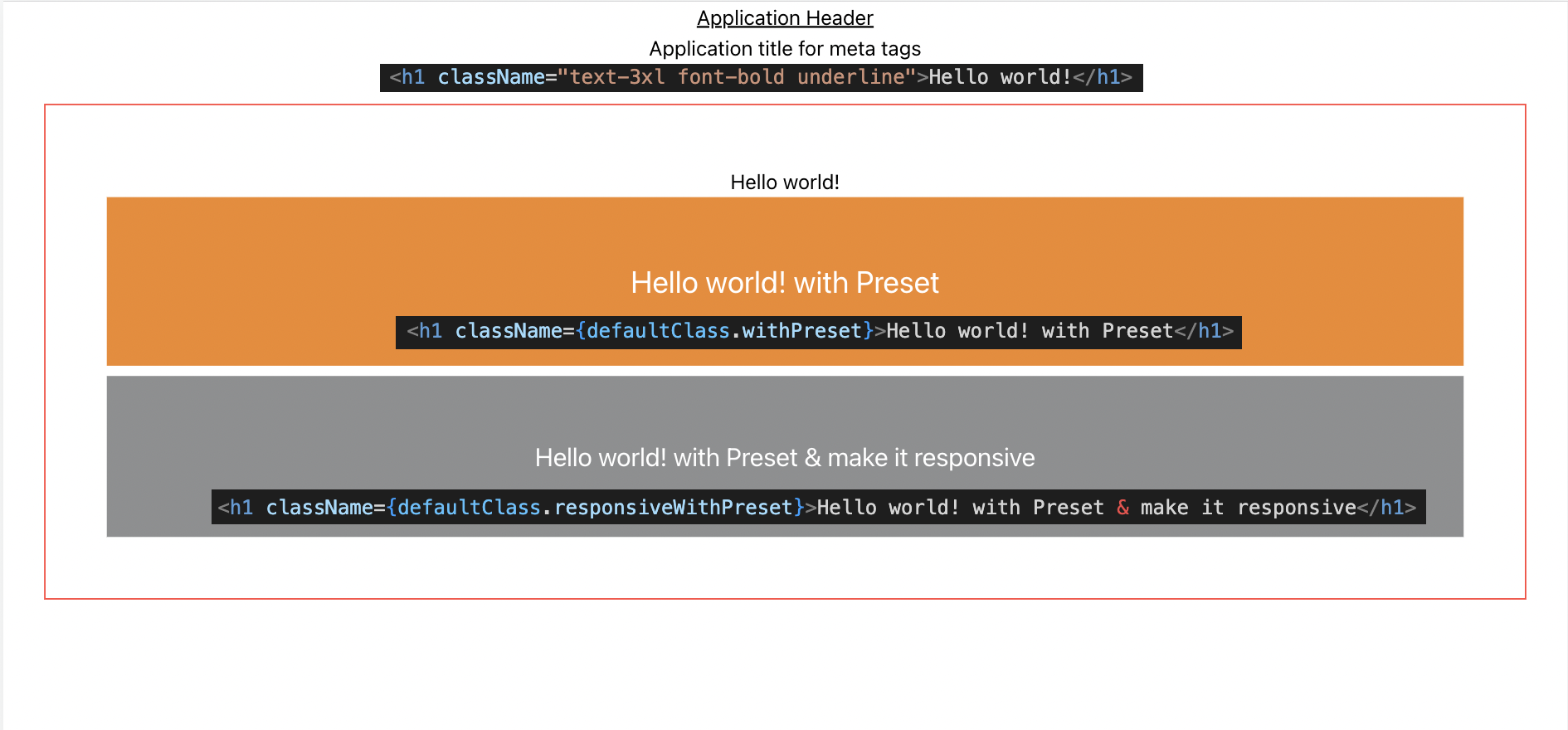
Let's see what I build and what benefit I am going to get out of it.
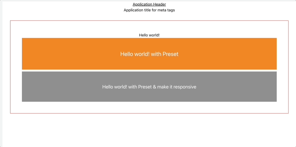
In the above view, the following points have been achieved without using any media query.
* Different padding based on different screen sizes.
* Different font styles with different screen sizes.
 Setting up your React project to be able to make use of Tailwind CSS is very easy and comprises only very few steps. In the following tutorial, you can find the step-by-step approach to installing Tailwind CSS into your React project and get started using Tailwind’s CSS classes for styling.
Step 1: Create React Application
Create a react application using the create-react-app command in your terminal.
npx create-react-app css-responsive-app —template typescript
Step 2: Install tailwind CSS
The installation guide is available here.
npm install -D tailwindcss postcss autoprefixer
npx tailwindcss init -p
//update tailwind.config.js
module.exports = {
content: [ "./src/**/*.{js,jsx,ts,tsx}", ],
theme: { extend: {}, },
plugins: [],
}
// add tailwind directives in index.css
@tailwind base;
@tailwind components;
@tailwind utilities;
After all the above steps, you can use Tailwind CSS classes in your HTML to get styled. From the tailwind CSS documentation site, your app.js could look like -
export default function App() {
return (
<h1 className="text-3xl font-bold underline"> Hello world! </h1>
)
}
But in real-life applications, it will be very hard to manage all CSS classes in HTML, and getting used to them is pretty hard. Let's improve more and make production-ready CSS classes.
Step 3: tailwind.config.js and tailwind.preset.js file setup
First, open up the tailwind.preset.js file and have the following like below -
Then set the themeColor.js file as well for a different colors.
Also set the tailwind.config.js file, to read the tailwind.preset.js file.
Now you are done with preset tailwind configuration, but you can extend all css presets based on your needs as well. Right now I am going to handle only different screen resolutions and font sizes. Every CSS style property can be extended like below -
boxShadow: theme => ({
buttonFocus: `-6px 6px ${theme('colors.brand.700')} / 0.3`,
dialog: `1px 1px 5px ${theme('colors.gray.600')}`,
headerTrigger: `0 4px ${theme('colors.brand.600')}`,
inputFocus: `-6px 6px ${theme('colors.brand.100')}`,
menu: '0 1px 3px rgba(0, 0, 0, 0.2)',
modal: `1px 0 ${theme('colors.borderColor.subtle')}`,
radioActive: `-3px 3px ${theme('colors.brand.100')}`,
radioFocus: `-3px 3px ${theme('colors.brand.100')}`,
thin: `0 1px ${theme('colors.gray.300')}`
}),
Step 4: Use the tailwind CSS class in your react component.
Once you are done with all configuration, I have been using composes to use my all tailwind CSS and used them together. like below -
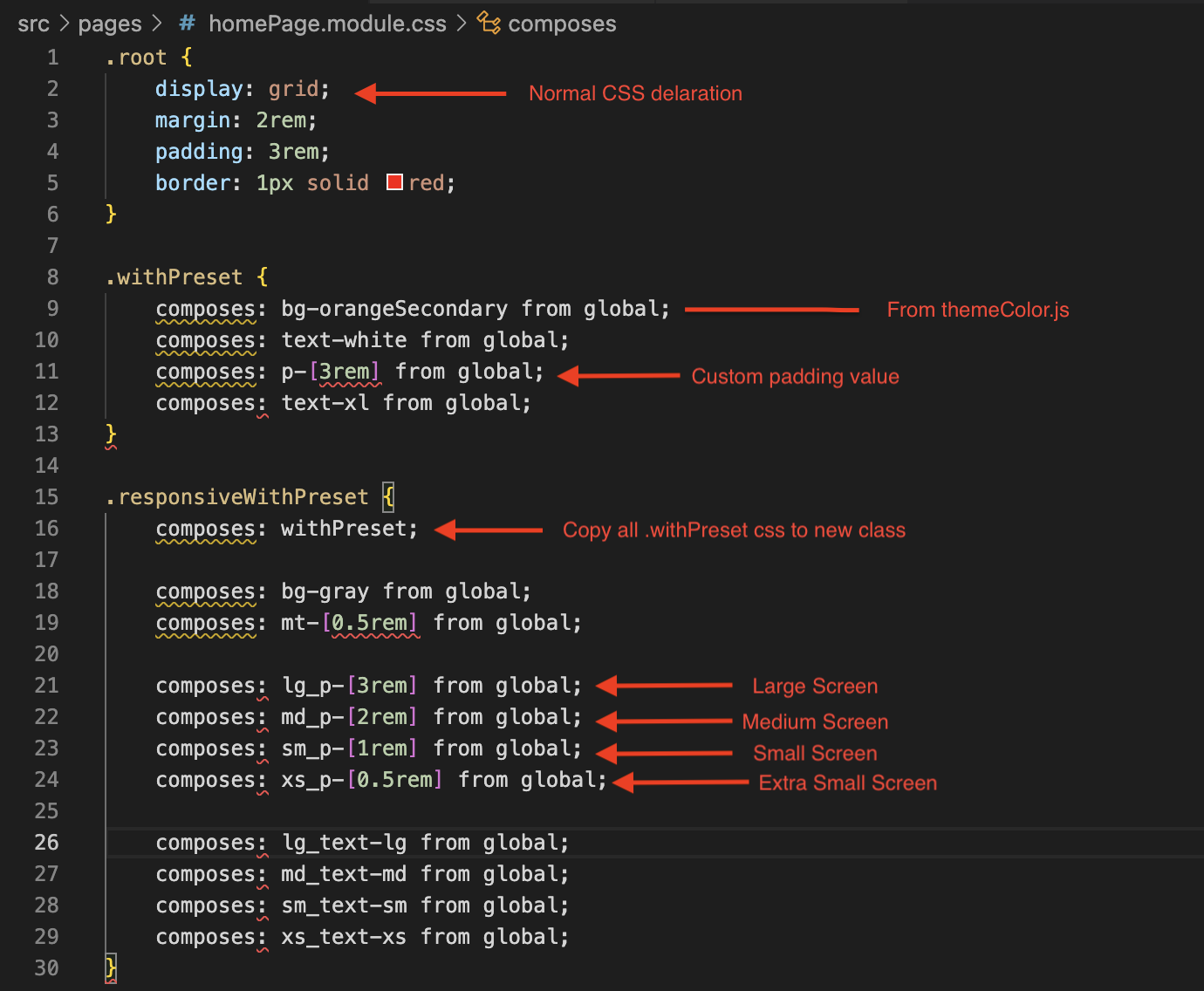
After all, is done you could use the above in your HTML, and, it's very clean and easy to use.
Step 5: Use class in .jsx or .tsx file.
import defaultClass from './homePage.module.css';
const HomePage = () => {
return (
<div className={defaultClass.root}>
<h1 className="text-3xl font-bold underline">Hello world!</h1>
<h1 className={defaultClass.withPreset}>Hello world! with Preset</h1>
<h1 className={defaultClass.responsiveWithPreset}>Hello world! with Preset & make it responsive</h1>
</div>
);
}
export default HomePage;
Is it not pretty clan and get responsive feature altogether in one single class? You can share your idea in below comment box.
Happy Coding!
Loading comments...