Component design on Storybook using NextJS TypeScript with Webpack 5
Storybook is a great tool for component design and having good documentation to re-use the components across applications. Storybook is a technology-agnostic which means it can be used with Angular, React & Vue. But here I am going to use React NextJs to create a few components and import those in the storybook as well.
Why do you need a Storybook?
- In short, to get an overview of your components and have documentation for those components for reuse in separate pages or places.
For a big application, where there are many developers who are partially working and sometimes it happens that one developer might not be aware of already build components, and the application ends up with multiple duplicate components with a different name. To overcome this redundancy, Storybook can help to get all components together in one place and have documentation on how to use this component.
In my case, I have created a very simple component and rendered those are in my page.
NextJs Application creation
In my experience, Next JS most enjoyable journey. It has so many update features like Zero configuration, TypeScript support, easy routing configuration, small bundle size makes the application faster and lastly, hot module reload (HMR) is comes all together. I have a complete blog for Next JS application creation and Routing configuration with SSR support.
Sorybook configuration with NextJS application
I have used storybook-cli to install storybook to our application.
npx sb init --builder webpack5
After successful installation, .storybook & stories foler being created.
.storybook- containes the configuration
stories - we will write our page & components for stories.
Also, in package.json file there are following changes we need to make to build & execute storybook-
"storybook": "start-storybook -p 6006 -s ./public",
"build-storybook": "build-storybook -s public"
While building and executing storybook, you might encounter the following issue -
info @storybook/react v6.4.9 info info => Loading presets info => Using implicit CSS loaders info => Using default Webpack5 setup 1% setup initializeinfo => Using prebuilt manager <i> [webpack-dev-middleware] wait until bundle finished 9% setup compilation DocGenPluginnode:internal/modules/cjs/loader:936 throw err; ^ Error: Cannot find module 'webpack/lib/util/makeSerializable.js'
To fix this issue, you need to open up the .storybook > main.js and have the following changes.
module.exports = {
"stories": ["../stories/**/*.stories.mdx", "../stories/**/*.stories.@(js|jsx|ts|tsx)"],
"addons": ["@storybook/addon-links", "@storybook/addon-essentials", "@storybook/preset-scss"],
"framework": "@storybook/react",
"core": {
"builder": "webpack5"
},
typescript: {
reactDocgen: false
}
}
With theabove chnage, your code will be build successfully.
Configuring stories with page & component
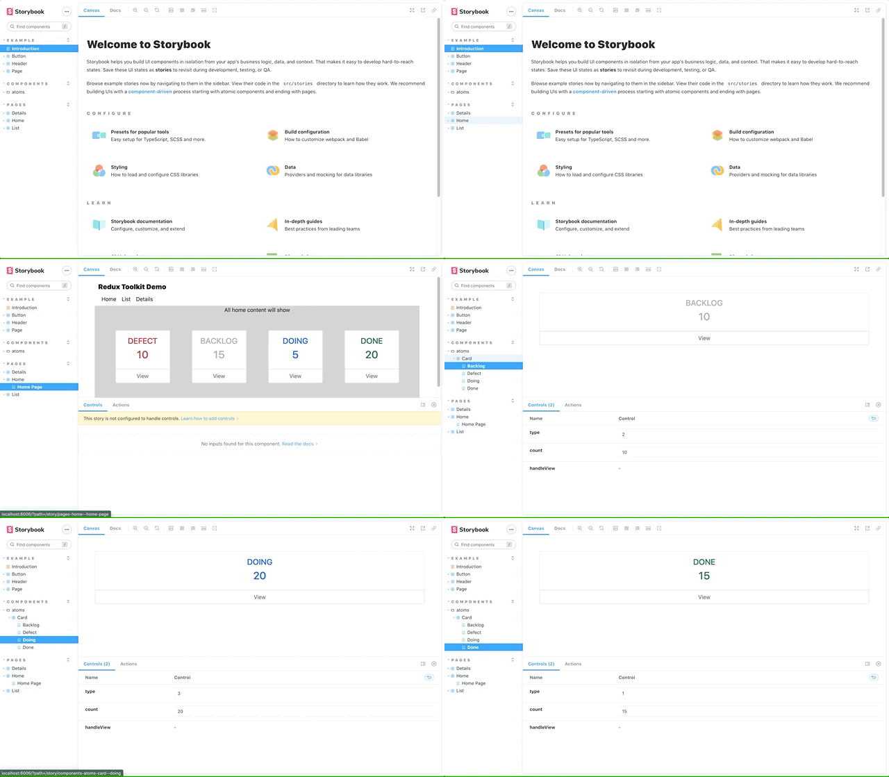
Let's create a stories homepage in our nextjs application.
So for that I created a file under stories > pages > home > home.stories.tsx
import Home from '../../../pages/index';
export default {
title: "pages/Home",
component: Home
}
export const HomePage = () => < Home / >
Then create components > atoms > card.stories.tsx
There I wrote the card configuration & pass difirent type to verify in all cases its works fine or not.
import Card, { ICardDetails } from "../../../components/Card/Card";
import { CARD_TYPE } from "../../../components/Card/card.constant";
export default {
title: "components/atoms/Card",
component: Card
}
const Template = args => < Card {
...args
}
export const Backlog = Template.bind({});
Backlog.args = {
type: CARD_TYPE.BACKLOG,
count: 10,
handleView: (cardDetails: ICardDetails) => {}
}
export const Defect = Template.bind({});
Defect.args = {
type: CARD_TYPE.DEFECT,
count: 5,
handleView: (cardDetails: ICardDetails) => {}
}
export const Doing = Template.bind({});
Doing.args = {
type: CARD_TYPE.DOING,
count: 20,
handleView: (cardDetails: ICardDetails) => {}
}
export const Done = Template.bind({});
Done.args = {
type: CARD_TYPE.DONE,
count: 15,
handleView: (cardDetails: ICardDetails) => {}
}
The above will provide exact look and feel for actual component, also its possible to validate the business logic for individual.
In case if you are still facing issues, I am sharing my package.json file with storybook version. It might help others to validate the package version to solve most of the unwanted issues.
package.json
{
"name": "storybook-demo",
"private": true,
"scripts": {
"dev": "next dev",
"build": "next build",
"start": "next start",
"lint": "next lint",
"storybook": "start-storybook -p 6006 -s ./public",
"build-storybook": "build-storybook -s public"
},
"dependencies": {
"bootstrap": "^5.1.3",
"next": "12.0.7",
"react": "17.0.2",
"react-dom": "17.0.2",
"sass": "^1.45.2"
},
"devDependencies": {
"@babel/core": "^7.16.7",
"@storybook/addon-actions": "^6.4.9",
"@storybook/addon-docs": "^6.4.9",
"@storybook/addon-essentials": "^6.4.9",
"@storybook/addon-links": "^6.4.9",
"@storybook/builder-webpack5": "^6.4.9",
"@storybook/manager-webpack5": "^6.4.9",
"@storybook/preset-scss": "^1.0.3",
"@storybook/react": "^6.4.9",
"@types/node": "17.0.7",
"@types/react": "17.0.38",
"babel-loader": "^8.2.3",
"eslint": "8.5.0",
"eslint-config-next": "12.0.7",
"eslint-plugin-storybook": "^0.5.5",
"sass-loader": "^12.4.0",
"typescript": "4.5.4"
}
}
I hope this will help others to start working on storybook and demonstrate your component before using it widely across the project. For any suggestion, please write below.
Happy Coding!
- LP


Loading comments...