Star Rating system is everywhere, it shows the impression to the user, how the product is. In this article, I will create a star rating component using react and convert 0 - 100% (percent) value into 1 to 5-star representation. It looks as follows -
To make this guide easier to discover and more relevant for readers, it now naturally covers react star rating, nextjs star rating, react component, custom react star, star rating component, and react rating component.
There are several in build libraries are available to create such component, then why still we are seeing to implement something in custom way? Here is the comparison, that could lead to understand properly why custom components are needed.
Custom components are designed as per the design system, a zero dependency on library, and ship code only what is needed. The component can be grown as per any future requirement.
Let's get started by creating an application using the create-react-app command like the below -
npx create-react-app rating-app
Then create a ratings.js and ratings.module.css file. Here, the idea is we are going to deal with two sets of star icons. One with filled with a golden colour and another is filled with white colour. Here is the two icon look like -
SVG icon (filled star):
<svg
  fill="none"
  height="{height}"
  viewBox="0 0 24 24"
  width="{width}"
  xmlns="http://www.w3.org/2000/svg"
>
  <path
    d="M12 4.5L14.3175 9.195L19.5 9.9525L15.75 13.605L16.635 18.765L12 16.3275L7.365 18.765L8.25 13.605L4.5 9.9525L9.6825 9.195L12 4.5Z"
    fill="#EBC03F"
    stroke="#EBC03F"
    strokelinecap="round"
    strokelinejoin="round"
    strokewidth="2"
  ></path>
</svg>

SVG icon (outline):
<svg
  fill="none"
  height="{height}"
  viewBox="0 0 24 24"
  width="{width}"
  xmlns="http://www.w3.org/2000/svg"
>
  <path
    d="M12.1053 3.68421L14.7074 8.95579L20.5263 9.80632L16.3158 13.9074L17.3095 19.7011L12.1053 16.9642L6.90105 19.7011L7.89473 13.9074L3.6842 9.80632L9.50315 8.95579L12.1053 3.68421Z"
    fill="#FCFBF8"
    stroke="#E2E0DA"
    strokelinecap="round"
    strokelinejoin="round"
  ></path>
</svg>

Understanding the initialisations, props, and callback -
The Rating component has a few props for configuration for your needs -
Rating.propTypes = {
  ratingInPercent: number.isRequired,
  iconSize: string,
  showOutOf: bool.isRequired,
  enableUserInteraction: bool.isRequired,
  onClick: func,
};
ratingInPercent:
iconSize:
showOutOf:
enableUserInteraction:
onClick:
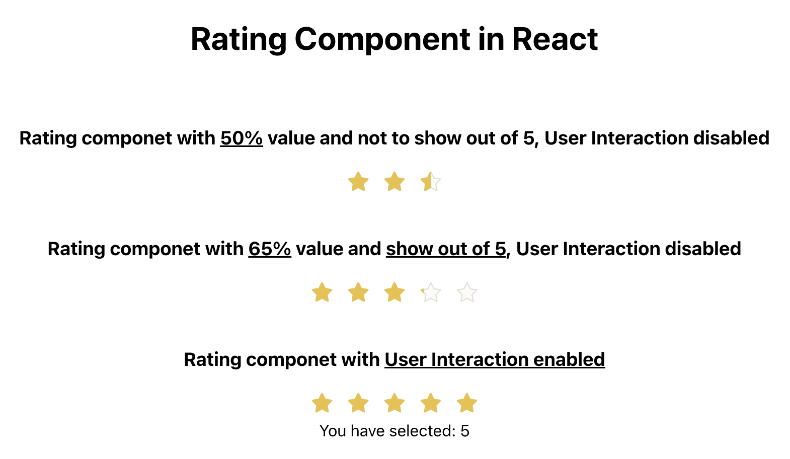
Demo time:
So, the custom rating component is ready to use, feel free to modify yourself based on your needs.
Happy Coding!